I was looking at some stats for Sports on TV because I was curious which sports and leagues were the most popular from visitors. The data represented in the charts below no means represents the popularity of a sport, team, or league. This is a small sample size (30 days) from a relatively new site. These statistics also don’t take into account any sports or leagues that aren’t in season. People naturally wouldn’t be looking at those teams or leagues. Just a sample of data from the last 30 days.
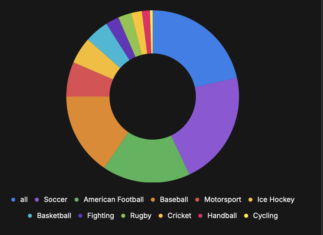
The first chart shows the most popular sports on the site. This means that users are specifically filtering by these sports.
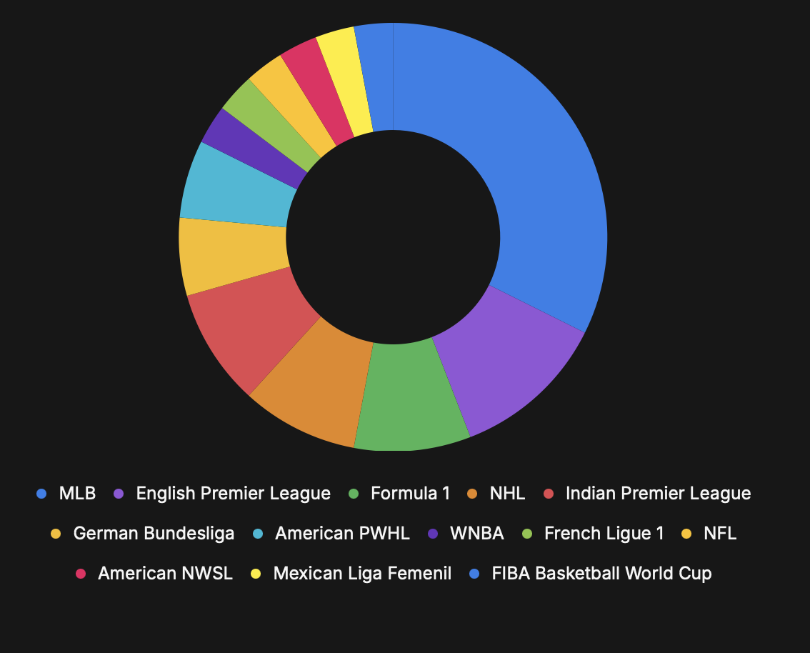
This chart shows the most popular leagues. The most popular leagues would also come from the most popular sports, since the league filters are based on the sport filters.
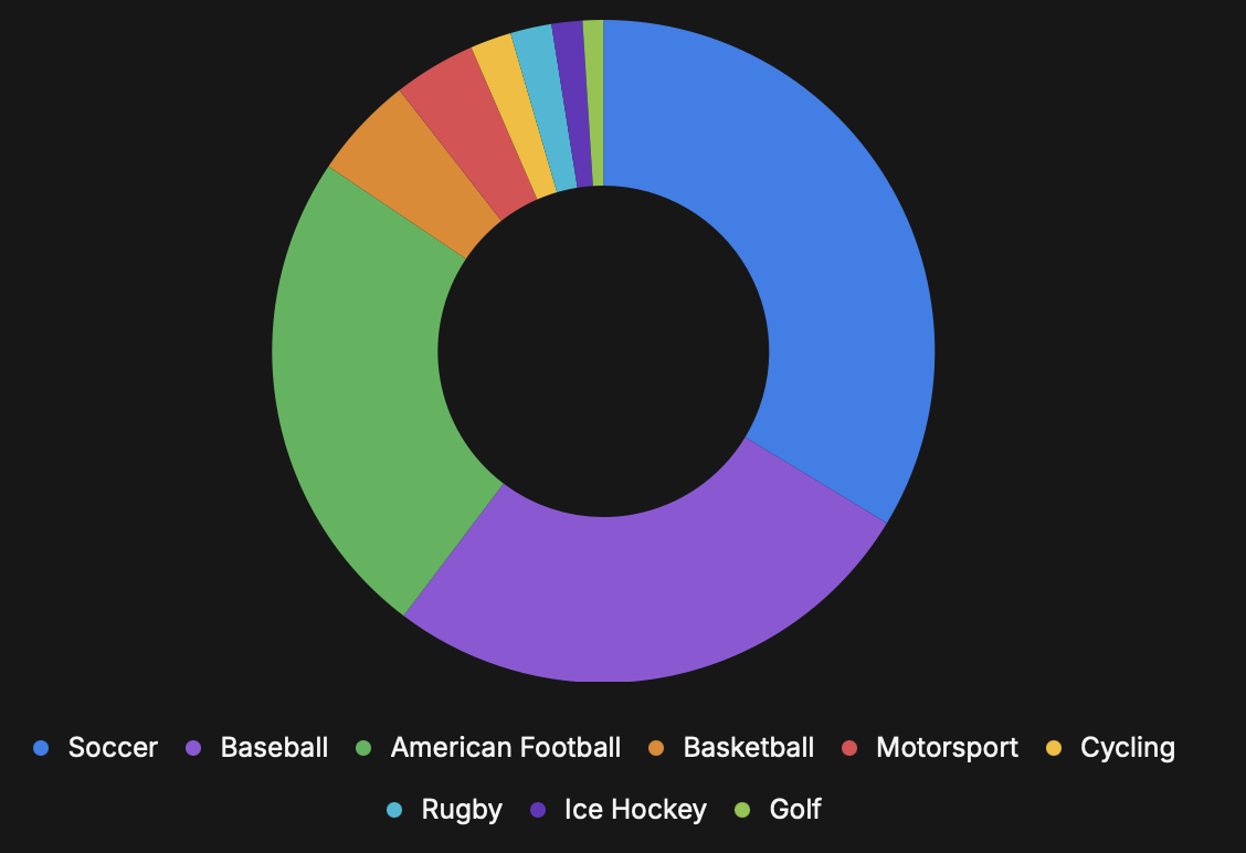
These are the sports with the most viewed events. When a user clicks on the details of an event from the list, these are the sport they belong to.
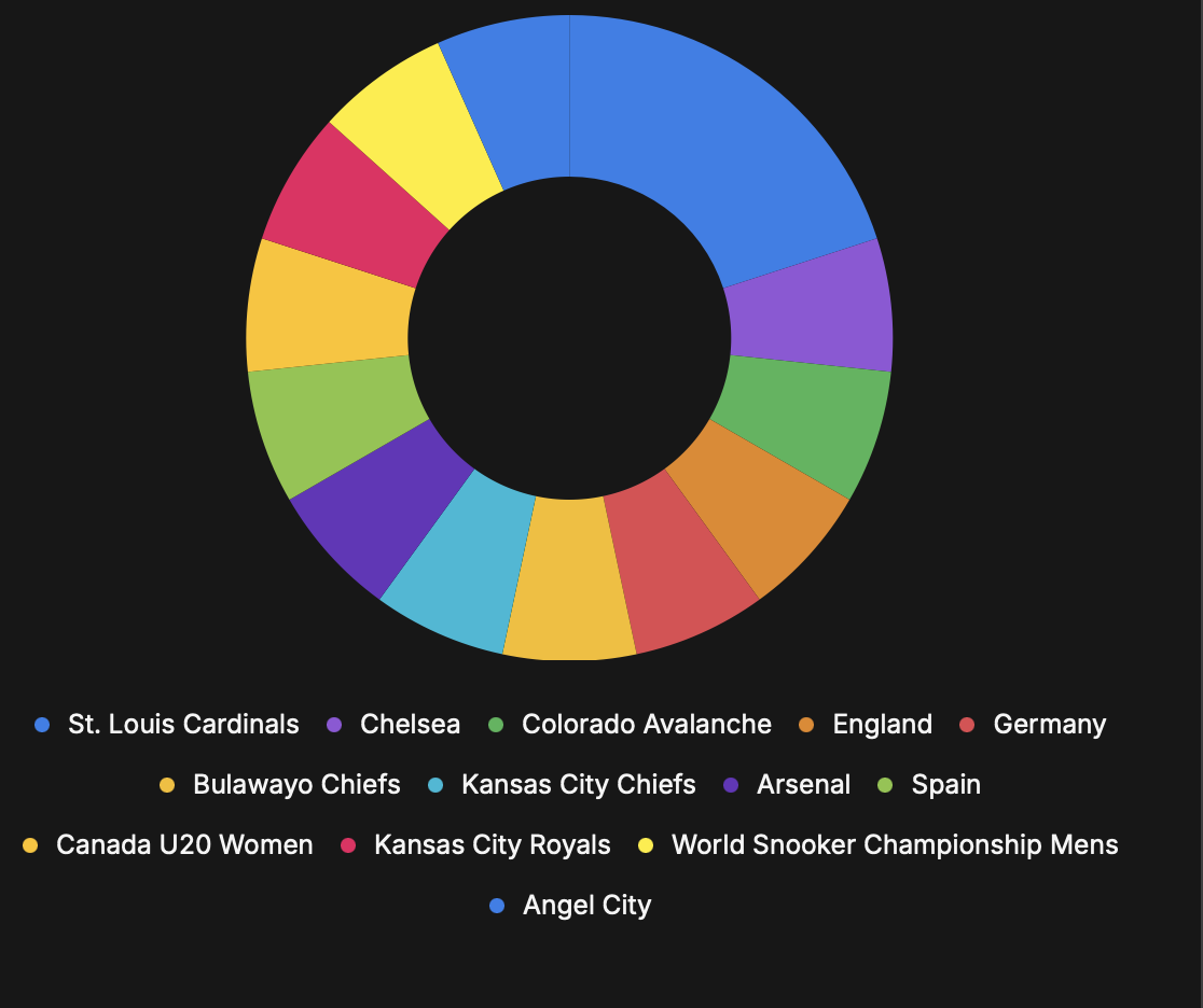
Lastly, we have the most popular teams. These are interesting because these are only registered if the user clicks on the team page from an event view. This is not a common interaction as most users are coming to look at what sport is airing and looking at the event details page only.
